BCAN Identity Concepts
In 2018 I created identity proposals for the then-new Baltimore Creatives Acceleration Network (BCAN). The program “activates resources and advocate for policies to support artists and creative entrepreneurs of all disciplines and backgrounds city-wide” through fellowships, accelerators, and more. They were looking for a logo and identity with a warm and approachable feel that would appeal to independent creatives at different stages of their career and across disciplines.
Background
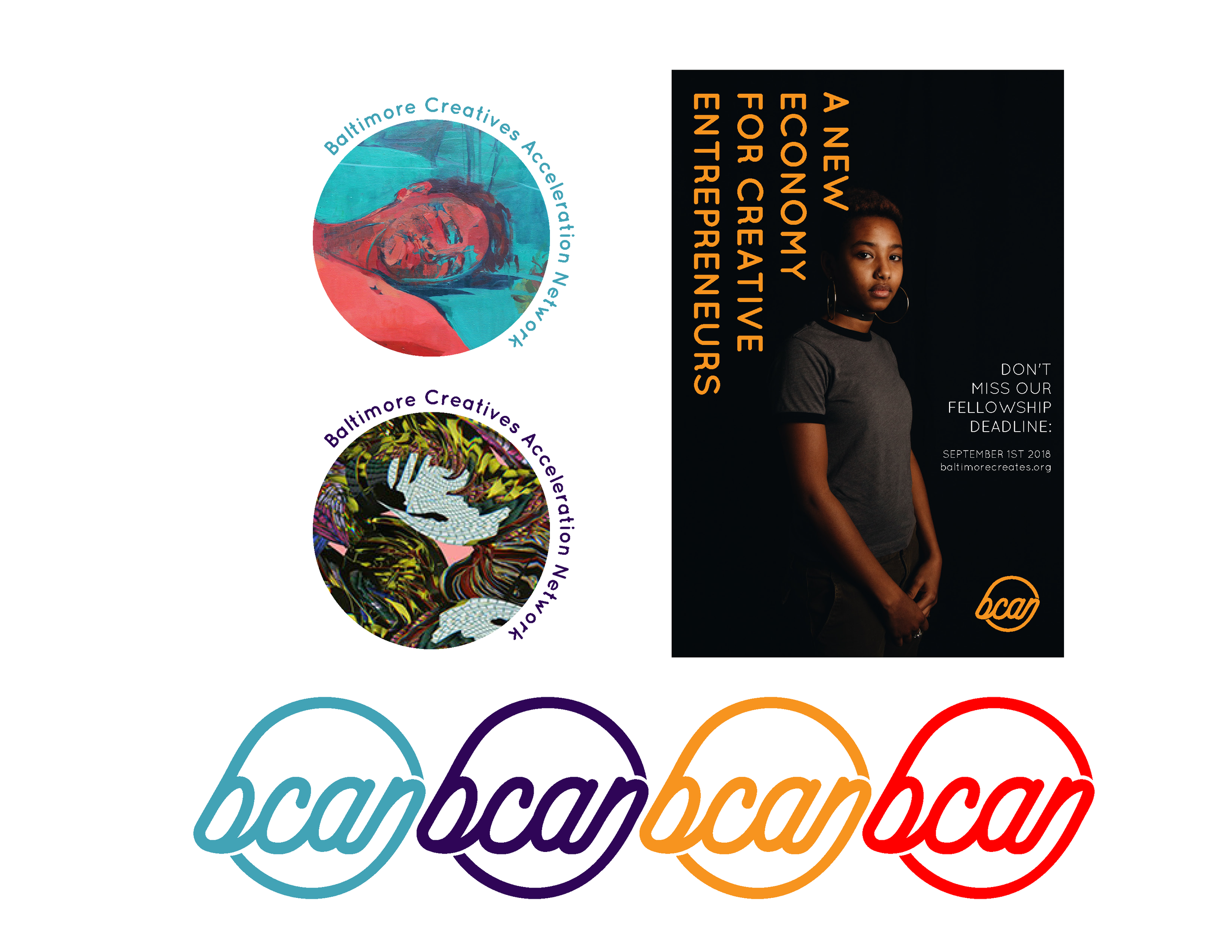
We focused on a modular logo concept that could feature the artwork of creatives within the network. I used the artwork of friends and recent graduates of MICA as the base images to display each logo’s potential for such a system. I learned and grew a lot creatively from working on this project and below are a few design directions, featuring a painting by Alexander Reynolds, a portrait of Suldano by Katelyn Brown, a digital collage by Khadija Nia Adell.

Interconnected
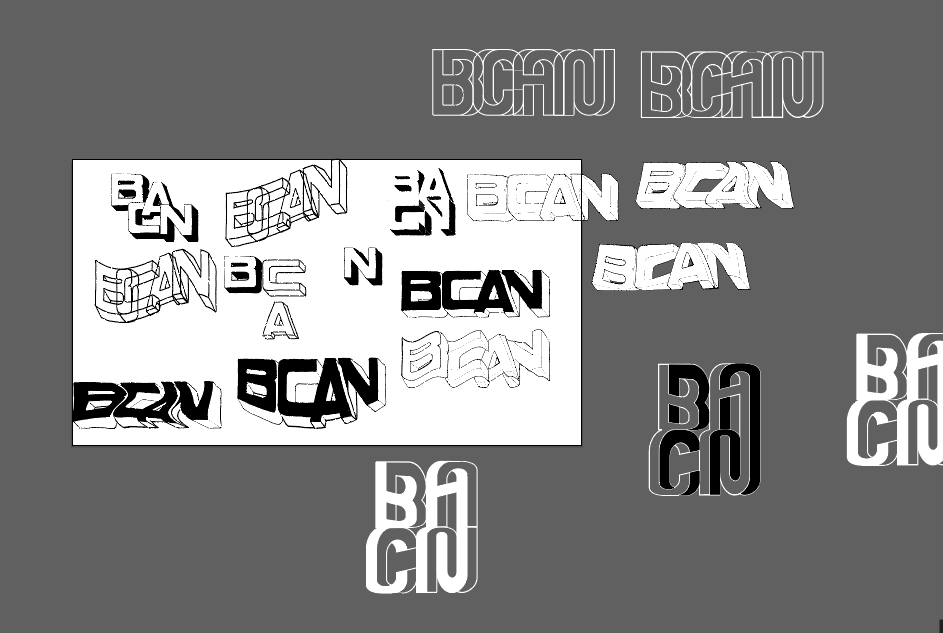
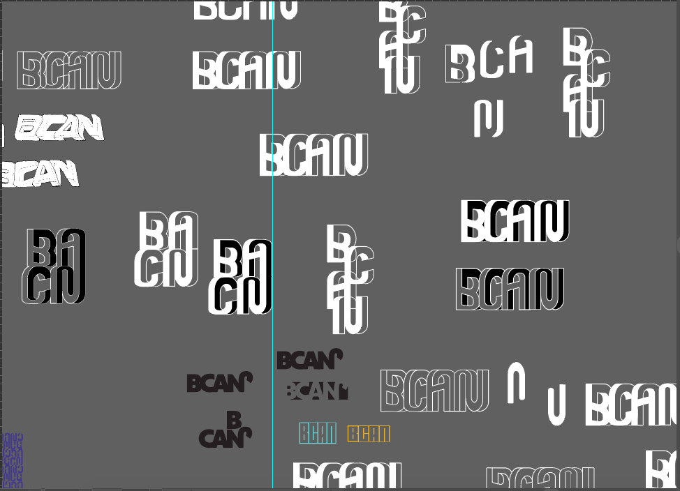
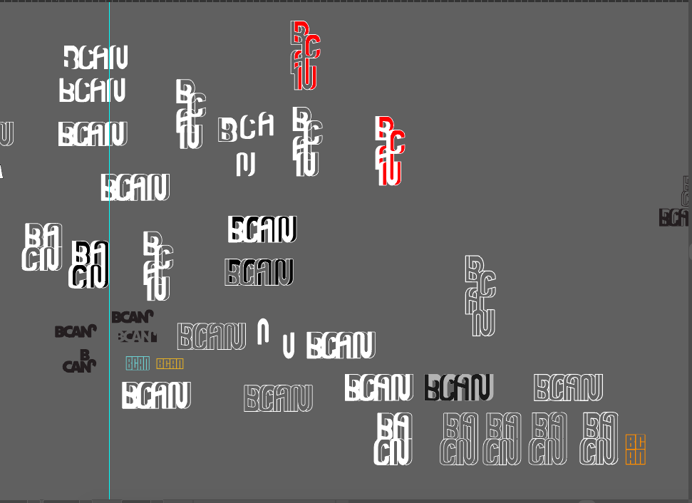
The first design I came up with featured this M.C. Escher-inspired typeface. BCAN wanted to emphasize interconnectedness between the network members and this was reflected in the intersecting typography. I explored how they could be containers for each other by playing with color and texture.
Early sketches in illustrator.


Brick By Brick
In this design, I was interested in creating a logo that could also function as a pattern. Drawing on inspirations from Baltimore’s unique architecture landscape, I created a brick-inspired logo.


B ”CAN”
This design focused on simplicity and legibility. For a seal option, I wanted to emphasize the pronunciation of BCAN (B “CAN”) by drawing on similar attributes of a “can” or container. The circular shape and script also reference the keyword “interconnectedness” and the cyclical nature of community economies. The design makes the logo functional for stickers, buttons, stamps, and more.